by Jalene Ippolito on December 02, 2021
If you’ve googled ‘SAP Business One dashboards’, chances are that you’ve found a lot of information on the native dashboards and pervasive analytics in SAP Business One version for HANA. And for good reason – those dashboard tools come standard in the HANA version of the software, and they enable users to easily create dashboards with little technical knowledge.
But what if you run the SQL version of SAP Business One (or you’re evaluating it)? Do you need to switch to the HANA platform to access dashboard functionality?
No. You can create dashboards in your SAP Business One system regardless of which database platform you use – you’ll just use a different tool.
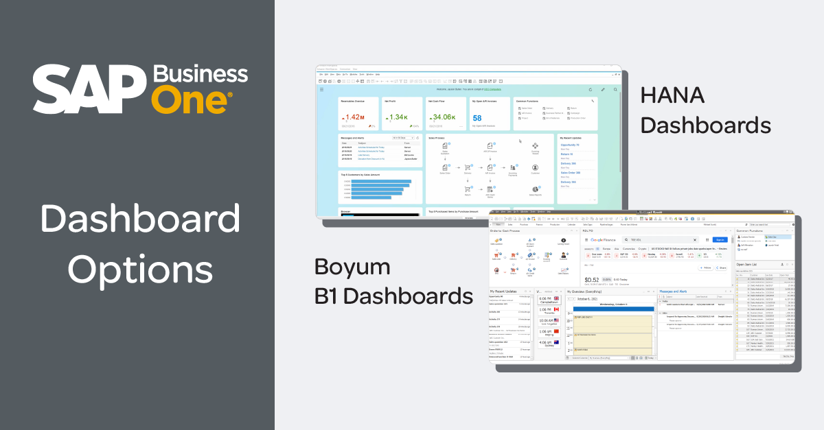
In this post, we’ll look at the two most common options for dashboards in SAP Business One – HANA dashboards and Boyum B1 Dashboards. Both solutions are developed with dashboard best practices in mind, but like anything, each has its strengths and things to be aware of. We’ll cover all this to help you fully understand your options.
Value of ERP dashboards
Whether you’re the owner of a small to mid-size business or an employee, wouldn’t it be great if you could sit down at your desk each morning, open a single screen and get a sense of where things stand in the business? How are sales doing? Inventory? Deliveries? Accounts receivable and accounts payable?
That’s what a dashboard enables you to do. It’s a collection of relevant metrics and key performance indicators (KPIs) that help users across your business evaluate performance and identify exceptions that need their attention. A well-crafted dashboard presents data visually so it’s easy to consume in just a few seconds and helps the viewer decide what actions to take next.
Building dashboards in SAP Business One version for HANA
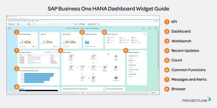
If you run SAP Business One on the SAP HANA platform, you have access to the built-in dashboard tool called the pervasive analytics dashboard designer. It’s a drag and drop style designer that allows you to choose from a gallery of pre-configured dashboard widgets or create your own based on custom queries.
You have access to a fairly extensive list of pre-created widgets and KPIs, right out of the box. It’s designed with non-technical users in mind, so you don’t need to be a query genius to create a dashboard.
The widgets are broken out into the following categories.
Analytic widgets
- The KPI widget helps you quickly understand how you’re tracking against your target key performance indicators. These can include a trend indicator to show how you’re tracking against a previous period or against a target.
- The dashboard widget includes pervasive analytics that allow you to access and visualize your data in a customized way.
Operation widgets
- The workbench is a visual representation of your process flows. Templates are included for Sales, Finance, Inventory and Purchasing. While you can’t create a new template from scratch, you can customize the existing ones by moving icons and editing the extended menus of related items for each step in the process.
- The recent updates widget displays your most recent transactions in the system so each user can easily see their work and access recent documents in one click.
- The count widget shows the number of items returned from a query. A simple example could be the number of open sales orders. Or you could use a more complex query to display the number of high value customers who contributed to more than 10% of your profit the prior year. This is a clickable element that gives you a list of what’s counted. From there you can click on the golden arrow to access each document.
- The common functions widget allows users to create shortcuts to the modules they use most often.
- The messages and alerts widget is like a system inbox that’s accessible right in a user’s dashboard so they can see items that require their attention.
- The browser widget allows you to embed commonly used webpages in your dashboard, so you don’t have to navigate to an outside application.
Ease of use is arguably the biggest advantage of the dashboards in SAP Business One HANA. The widget gallery gives you lots of metrics and visualizations to choose from and you can add, remove, rearrange and resize widgets quite easily. This simplified experience can be great for non-technical users.
But it does have limitations in terms of how easily you can customize the widgets and the queries behind them. If you’re a more technical user who likes to tinker with the data and generally have more control over your dashboard, Boyum B1 Dashboards might be a better fit.
Using Boyum B1 dashboards for SAP Business One
While we use Boyum B1 Dashboards as the default option for SAP Business One on SQL, you can use the solution in a HANA system as well. This gives you greater control over your dashboards, while still retaining access to other HANA functionality.
Pretty much anything you can do with the HANA dashboards you can also do with B1 Dashboards. The biggest difference is usability. B1 Dashboards requires a bit more user knowledge, so if you don’t have technical expertise internally, you’ll work closely with your SAP Business One partner to customize the dashboard.
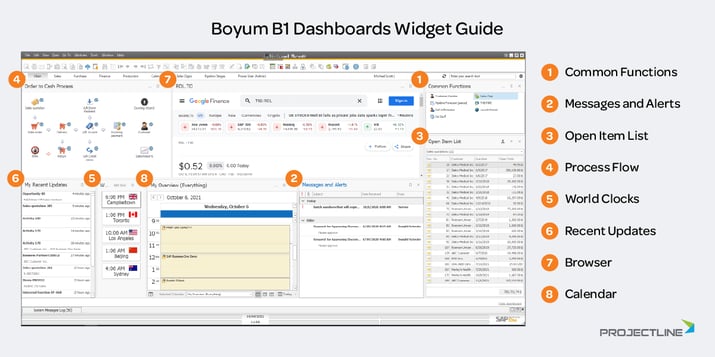
Like the HANA dashboard designer, B1 Dashboards comes with a widget gallery of pre-created metrics that you can choose from and customize as needed.
- The common functions widget allows users to create shortcuts to the modules and Boyum functions they use most often, with the ability to customize the icons associated with each function.
- The messages and alerts widget is like a system inbox that’s accessible right in a user’s dashboard so they can see items that require their attention.
- The open item list gives you an interactive list of open items for a given object, like sales orders. You can easily switch between objects by selecting a new option from the drop-down list and drill down to each document via golden arrows.
- The process flow widget mimics the workbench in HANA with pre-defined templates for Sales, Finance, Inventory and Purchasing. While you can’t edit the process flows in B1 Dashboards like you can in HANA, B1 Dashboards allows you to customize a process flow from scratch (which you can't do in HANA).
- The world clocks widget allows companies that deal in multiple time zones to easily check current time as they’re reaching out to customers and suppliers.
- The world map widget allows you to visually represent your data based on geography. Note that this visualization isn’t available in the HANA dashboards.
- The recent updates widget displays your most recent transactions in the system so each user can easily see their work and access recent documents in one click.
- The browser widget allows you to embed commonly used webpages in your dashboard, so you don’t have to navigate to an outside application.
- The calendar widget gives you an overview of your daily activities inside SAP Business One, with the option to integrate with your Outlook calendar using Boyum CRM for Outlook.
As you can see, there are some visualizations and interactive elements in B1 Dashboards that you don’t get in HANA. There are a few other features that we’ve found valuable when creating dashboards for our customers.
- You have access to pre-created dashboards for Sales, Purchasing, Finance, Service and Production. These are a great starting point that you can customize to your needs.
- You can show trend KPIs inside a grid.
- You can make tables easier to understand with row fills relative to top values and targets.
- You can add golden arrows in the dashboard for easy drill down into system documents.
While B1 Dashboards has many advantages, it’s worth repeating that you do need a deeper level of knowledge to create dashboards effectively using this solution. Even if you don’t have the expertise in-house, your SAP Business One partner can help you. The cost of their time will be worthwhile when the result adds value to your day-to-day operations.
The other consideration worth mentioning is the look and feel. Some say that B1 Dashboards aren’t as visually appealing compared to HANA dashboards. In most cases, they’re probably looking at a dashboard that’s been poorly designed. As previously mentioned, HANA dashboards use a simple snap to grid experience that keep users within certain confines when designing dashboards. With B1 Dashboards, you have more flexibility and control over the design which can be a double-edged sword if you have less technical users. Your SAP Business One partner can help you design a visually appealing – and valuable – result with B1 Dashboards.
Closing thoughts
Like most things in life, there’s no silver bullet on dashboards. It’s never quite that simple.
Both options we’ve reviewed here can work well for SAP Business One users. It really depends on your needs – not just for dashboards, but for your ERP system as a whole. While we’ve focused our discussion on dashboard functionality between HANA and SQL, there’s more to consider in your decision on platform.
Ready to explore SAP Business One?
We can help you evaluate the options and guide you to the right solution based on your business size, structure and processes.
