by Jalene Ippolito on October 07, 2021
When you hop into the driver seat of your vehicle, the first thing you see is the dashboard. In just a few seconds, you can see how much gas you have, check the engine temperature and see if anything urgently needs your attention. Throughout your drive, your dashboard will continue feeding you valuable information, like changes in speed, fuel levels and more, so you can make quick decisions.
Transfer that same concept into business and you can see how valuable a dashboard is. Whether you’re a business owner, department leader or employee, a well-crafted dashboard can give you a quick view of your performance and provide direction on what to do next.
As an ERP partner, we consistently see dashboards, reporting and analytics as a top priority for the small to mid-size companies we work with. Survey data from Brainyard indicates much the same – producing better reporting and KPIs (key performance indicators) is a priority for nearly 40% of finance teams. These companies want to stay nimble as they grow and easy access to reliable data is what helps them achieve that. The best news? With the tools available today, you don’t have to be a tech wiz to create dashboards – users at every level in the organization can access the information they need to do their jobs.
What is a business intelligence dashboard?
 A business intelligence (BI) dashboard (also referred to as a dashboard for the sake of simplicity) is an information management tool that uses data visualization to display a selection of metrics. Together, these metrics tell a story about how the business is performing and provides insight into what areas need attention.
When you think about all the data your company generates daily, you can see why a dashboard is so valuable. Without it, there’s simply too much data to comprehend and draw insight from. Like the dashboard in your car, it provides a big picture view of the most important things you need to know, in a visual format that you can easily understand.
Benefits of dashboards for SMEs
When you think back to the early days of your company, you probably had a good handle on all the activities and how the business was doing, even without the hard data to back it up. Many companies run that way for years – managing by their gut…until they can’t. A good dashboard gives you access to the data that answers your questions about the business and enables you to manage by the numbers.
But the benefits of a BI dashboard aren’t limited to business owners or C-suite executives. Your entire team can gain value that will transform how you operate.
- Transform large amounts of data into simple visualizations that help you quickly interpret the data and determine the next steps to benefit the business.
- Given that we process visual data faster than written, having an easy, visual way to view, understand and analyze data empowers users to make faster, more informed decisions.
- Identify and analyze positive trends to find new opportunities, while quickly spotting downward trends.
- Increase efficiency by serving up key information proactively and spending less time compiling reports.
- Trust that you’re making decisions based on accurate information. The great thing about dashboards is that they pull data straight from the source – there’s no manual intervention and no opportunity for human error on the reporting side. The confidence in your data increases even further if you’re using an ERP system as your single source (we’ll talk more about that later).
4 types of dashboards
Whether you’re using the dashboard tool in your ERP system or some other dashboard application, creating a dashboard is fairly easy to do using pre-defined templates. But for your dashboard to be effective, you should create a plan before you start dragging and dropping widgets. The first thing to consider is the type of dashboard – each serves a different purpose and the type you choose will influence the questions you set out to answer and the KPIs you select.
- Strategic dashboards are like your high-level overview. They’re typically aimed at C-suite and senior leadership to demonstrate the health of the business and help identify areas of opportunity.
- Analytical dashboards go much deeper and tend to be highly focused, providing detailed analyses of data trends (what, why, how). They measure data variables over time to determine what’s working and what’s not.
- Operational dashboards focus on KPIs that monitor real-time operations of the business or a specific department. You’ll typically see measurements comparing current state to targets or past performance.
- Tactical dashboards are often used for middle management, offering insight into weekly trends and metrics that drive internal processes.
8 best practices to create effective dashboards
One of the biggest challenges when creating a dashboard is editing down. The list of questions you want to answer about your business (or even a single department) could be endless. But remember that data analysis is only as good as the questions you ask. So, for each dashboard, be clear on what it is that you want to find out. The more specific your questions, the more valuable and actionable the answer will be.
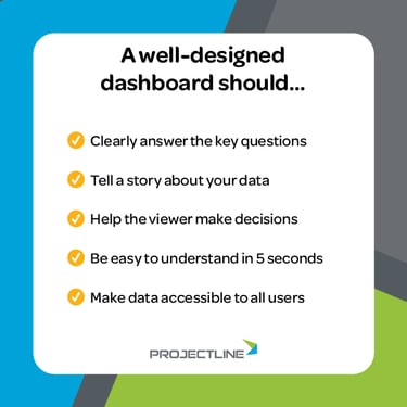
Keep in mind that a good dashboard should:
- Clearly answer the audience’s questions.
- Tell a story about your data, without revealing too much or too little information.
- Point the viewer in the right direction to make decisions.
- Be easy to understand within 5 seconds.
- Make data easily accessible to all users.
Now that we know what a good dashboard should do, it’s time to look at how to create a dashboard that works.
- Know your audience. Consider the questions they want to answer, the information they need and how technical they are.
- Keep it simple. Remember that effective communication is your top priority. Use consistent alignment and add white space to enhance readability. Avoid clutter that distracts from your message – focus on clean, minimalist design without too many ‘extra’ design elements.
- Choose the right data visualizations. Consider how well the visualization relays the intended information.
- Provide context to the data. Add clear titles to each chart or graph so the viewer knows what they’re looking at. Include labels, time periods and currency to help your audience properly interpret the data.
- Keep refining over time. Continuous improvement applies to your dashboards – periodically review, collect feedback from your team and enhance to ensure you’re answering the right questions.
- Avoid one-size-fits-all dashboards. Trying to fit every KPI for the whole business on one dashboard will be overwhelming and difficult for people to understand – the opposite of what you want in a dashboard! Creating specific dashboards for each audience will keep people focused on what’s most important to them, whether that’s by management level, department or some other grouping.
- Put key information first. Organize your content the way we read – top to bottom, right to left. The most important information will be first (top left) and decrease in importance as you move down the page.
- Select colors carefully. Stick to a limited set of colors and use them consistently throughout.
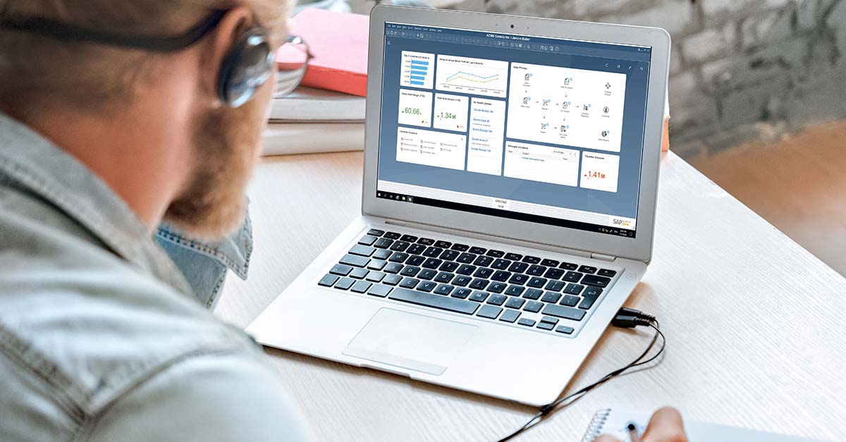
Leverage dashboard tools in your ERP system
There’s one big question we haven’t touched on yet – where will your data come from?
If you’re running a collection of disparate systems, creating a dashboard is certainly still possible, but it’s more difficult to gather the data in one place. For growing companies, ERP software can change the game entirely by pulling your core business data into one system. From there, you can use the built-in dashboard tools to get the insight you’re looking for. And without the constant manual process of importing, exporting and reconciling data from multiple systems, you can truly have confidence in your data. Seems much simpler, doesn’t it?
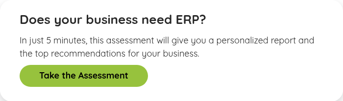
Take our easy, 20-question ERP Need Assessment to find out if ERP is the right next step for your business. It’s quick and free—and you’ll get a personalized report with recommendations based on where your business stands today.